Design system case study · Fintech
Scaling three design systems across 16+ products
FUPS is a Turkish fintech that offers a digital wallet, prepaid cards and money transfers to a young, digital-first audience. FUPS Bank brings a fully digital bank into the same ecosystem. I own the design systems both are built on.
- Role
- Product Designer, Design Systems
- Team
- 1 director, 1 team lead, 5 senior product designers, 2 UX researchers
- Platforms
- iOS, Android, Web
What I did
- Led the move of every file and all documentation from Sketch to Figma
- Set up the Figma structure for every project across FUPS and FUPS Bank, including internal apps such as PF, Backoffice and CRM
- Designed the token architecture: primitive and semantic colours, spacing and typography as Figma variables
- Built and manage 1,000+ components across the e-money and bank products and internal apps such as PF, Backoffice and CRM
- Wrote the guidelines, the contribution model and the documentation site
- Built a Claude skill that checks UX writing in Figma: connected through Figma MCP, it checks our agreed rules for date formats, formal and informal address and currency formats, flags wrong usage and suggests the right one
- Set Definition of Done rules and showed teams how to use them well, which clearly raised the task success rate
The challenge
The product and team landscape grew fast: an e-money app, a bank and a steady stream of internal panels. As the number of projects grew, task completion time, quality and consistency all needed to improve. Every new product redrew the same decisions, and the UI drifted between iOS, Android and Web.
Approach and design decisions
From Sketch to Figma
I led the migration of every file and all documentation from Sketch to Figma, and rebuilt the library around Figma components with shared rules for naming and Auto Layout. Tool overhead dropped and design and engineering got one place to work.
Three systems, one architecture
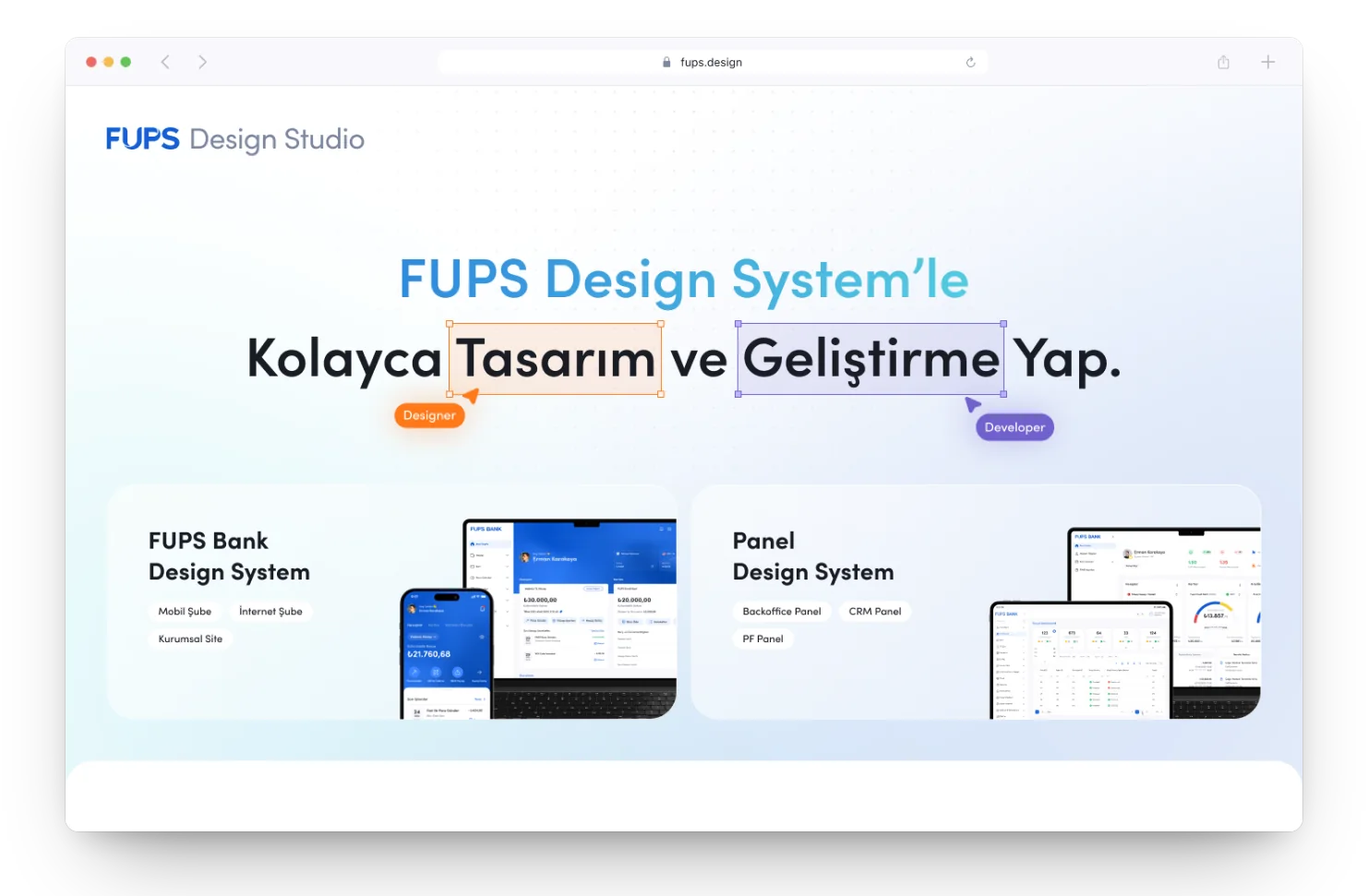
The bank needed more than the e-money library could offer, and internal panels needed denser, smaller components. We split into three systems, e-money, bank and panel, that evolve independently while keeping what a design system is for: speed and consistency.
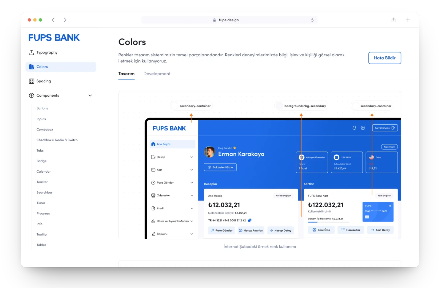
Colour tokens: primitive to semantic
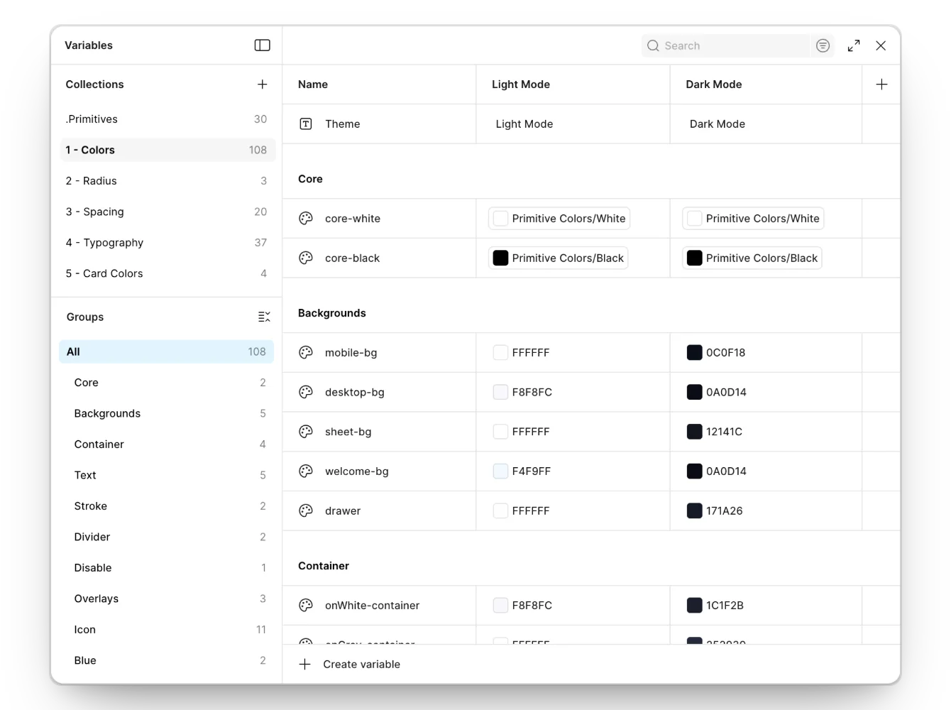
Primitive tokens hold brand and neutral values. Semantic tokens describe background, surface, text, border and state. Light and dark mode switch by reassigning tokens instead of overriding components.
Spacing and typography as tokens
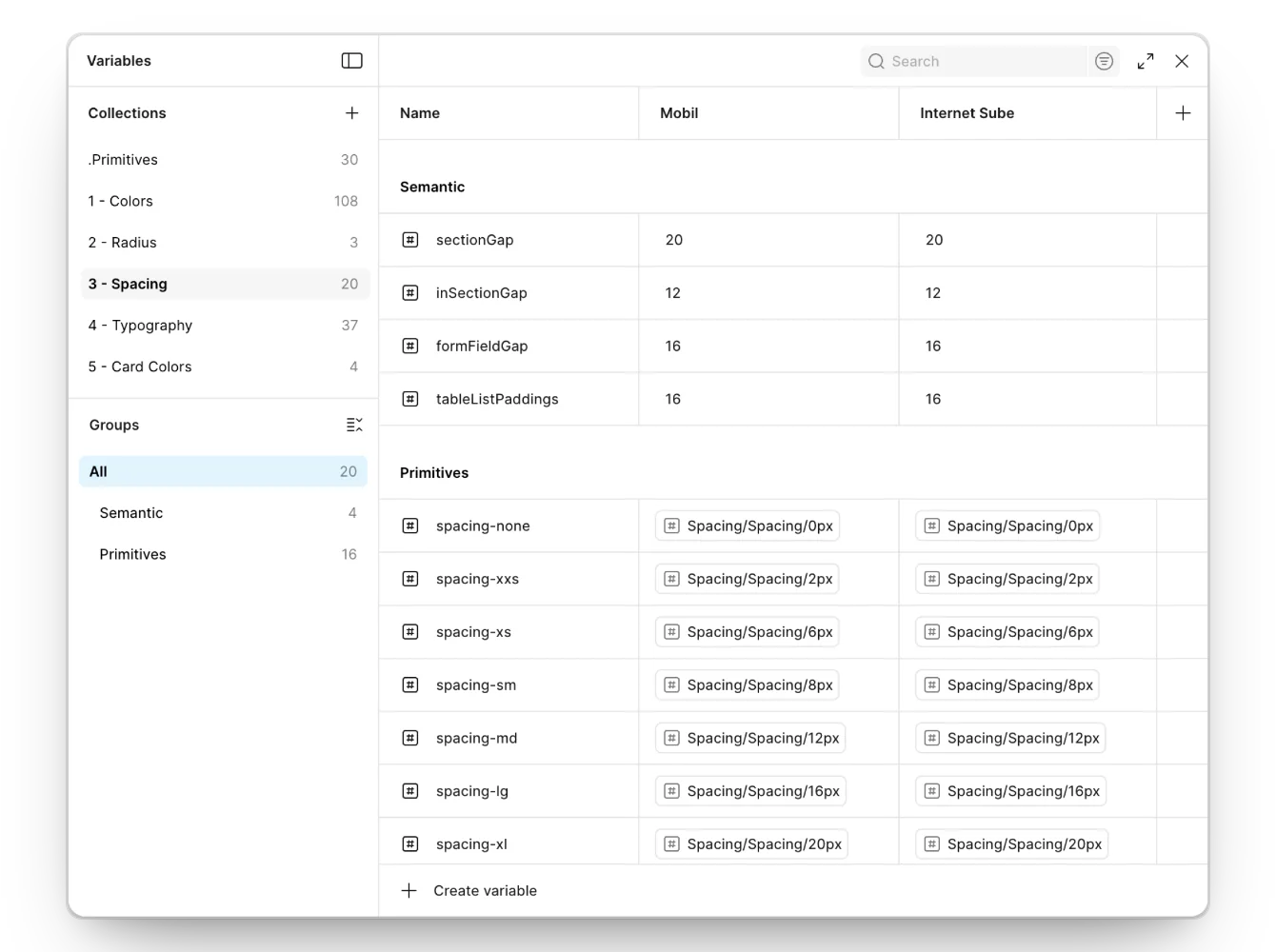
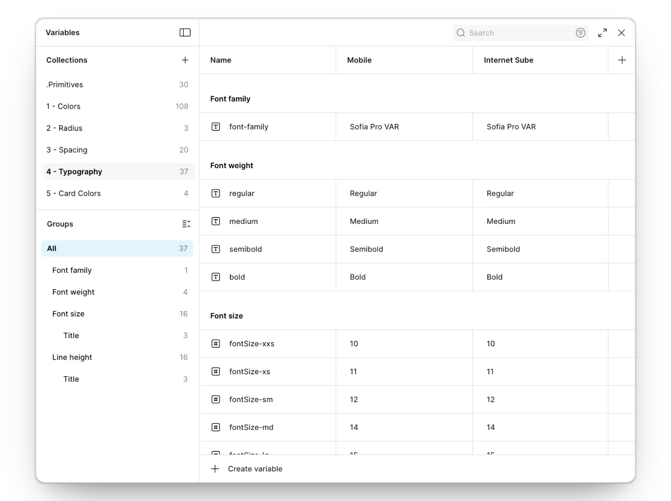
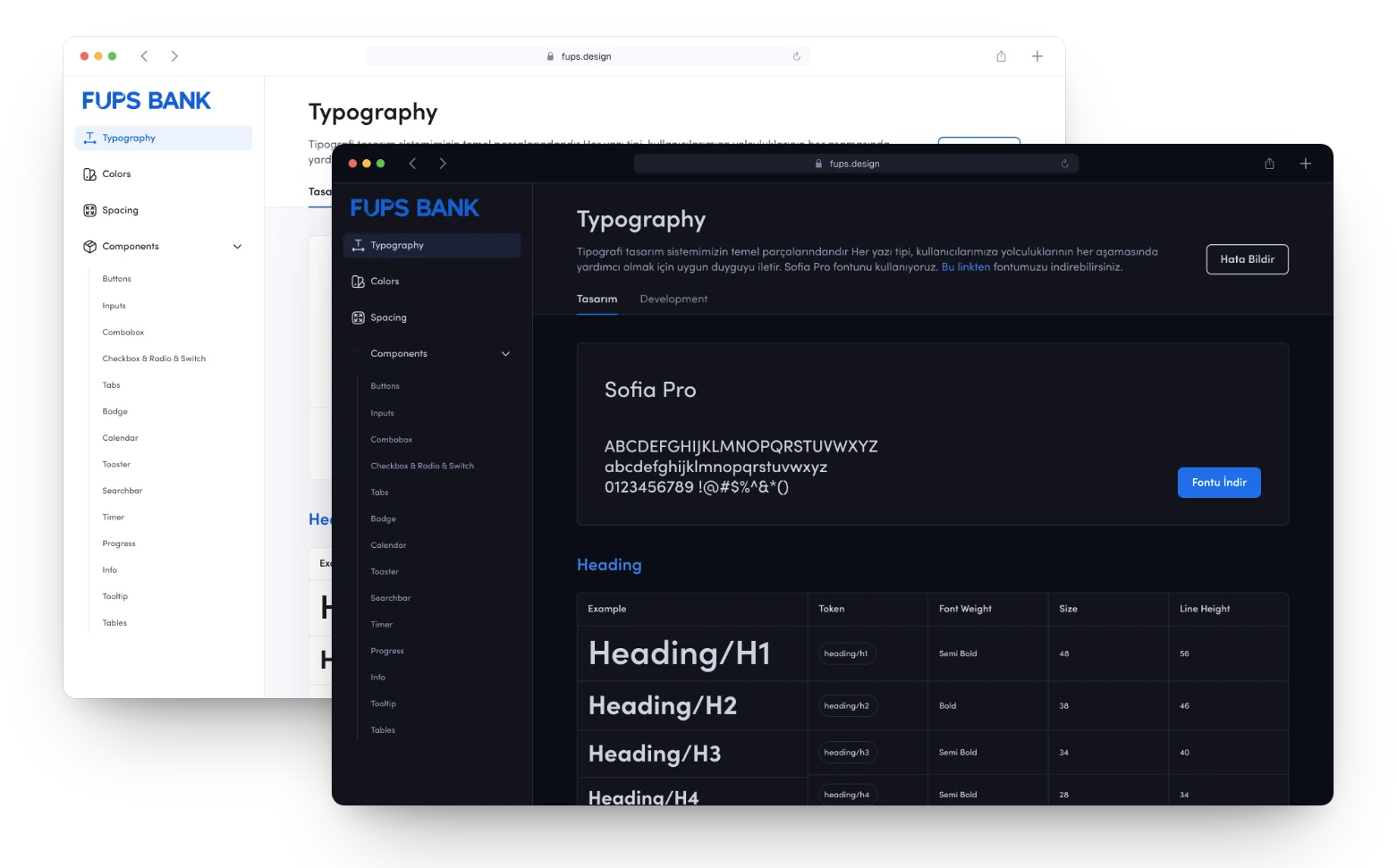
Spacing primitives map to semantic layout tokens such as section gap, form spacing and list padding. Typography uses the same two layers: family, weight and size primitives feed title, body, caption and button styles. Big changes that matter for a bank, such as a font, a colour or a corner radius, can now be applied in minutes.
Components that explain themselves
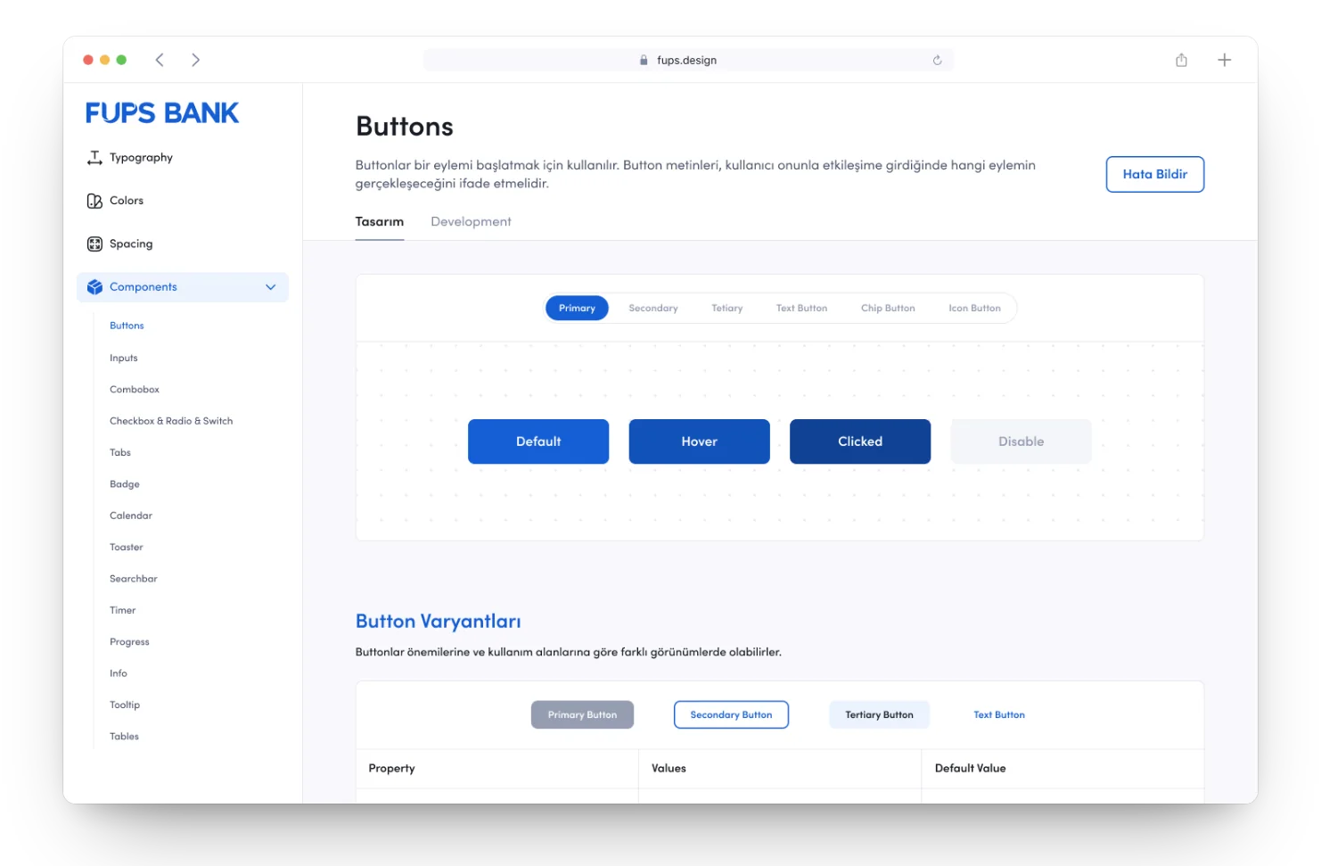
Every component page shows its variants, its states and its properties next to each other: primary, secondary, tertiary and text buttons; default, hover, pressed and disabled; small, medium and large. Designers pick from the page, developers read the same table.
Governance and adoption
I wrote the usage guidelines, the contribution model and the documentation, now published as a documentation site for designers and developers. The system is actively used by 7 designers, 2 researchers and 20+ engineers.
Inside the Figma file
Six collections, 202 variables, two kinds of modes
The system does not live in hex codes scattered across frames. Every decision is a Figma variable, primitives are aliased by semantic tokens, and modes switch both the theme and the platform. This is the structure behind the numbers.
| Collection | Vars | Modes | What it holds |
|---|---|---|---|
.Primitives | 30 | Raw brand and neutral values. Every other collection aliases them. | |
1 - Colors | 108 | LightDark | Semantic colours in groups for core, backgrounds, containers, text, stroke, divider, disabled, overlays, icons and brand hues. Platform roles such as mobile-bg, desktop-bg, sheet-bg and drawer resolve per theme. |
2 - Radius | 3 | The corner radius scale. | |
3 - Spacing | 20 | Mobilİnternet Şube | 16 primitives, spacing-none to xl, aliased by 4 semantic tokens: sectionGap 20, inSectionGap 12, formFieldGap 16, tableListPaddings 16. |
4 - Typography | 37 | Mobileİnternet Şube | Font family (Sofia Pro VAR) and four weights as string variables; 16 font sizes and 16 line heights as numbers. |
5 - Card Colors | 4 | A separate set for card colours, kept apart from interface colours. |
Aliases, not copies
Semantic tokens point at primitives. Change a primitive and every alias follows; switch a theme and the aliases re-point, while the components stay untouched.
Modes for theme and platform
Colors switch between Light and Dark. Spacing and typography switch between the mobile app and İnternet Şube, the web bank, so a platform difference is a mode, not a second component.
Type as variables
The family and weights are string variables, sizes and line heights are numbers. A typeface or scale change is one edit across both platforms.
Named for intent
sectionGap, formFieldGap, tableListPaddings: the name says where a value is used, so designers and engineers make the same choice without measuring.
Documented like a product
A documentation site with live examples, variants, states and property tables, written for designers and developers alike.
How I used AI
I built a Claude skill for UX writing checks. It connects to Figma through Figma MCP and checks our agreed rules, such as date formats, formal and informal address and currency formats, directly in Figma, then flags wrong usage and suggests the right one. I also use AI on the documentation side: first drafts of component descriptions, usage guidelines and the wider documentation, which I then review and edit before they ship.
The outcome
Feature delivery became 40% faster and components behave the same on iOS, Android and Web. Production now matches the Figma designs one to one, so UI review has almost disappeared. Onboarding new team members became smooth, and the task success rate rose sharply on both the engineering and the design side.