Case study · Own product · iOS & watchOS
I couldn’t find the training app I needed, so I designed and built it
I’ve been training for three months, and no app covered what I actually needed: my own programs, a guided session between sets and a food log without a meal plan. So I built one. GYM Paper is free for everyone, with no account, no ads and no tracking; data stays on the device and in the user’s own iCloud. In a week it went from a web app on my home screen to a native app for iPhone and Apple Watch, passed App Review and shipped its first update. I designed and built it with Claude.
- Role
- Founder: product, design, development
- Platforms
- iPhone, iPhone Duo, Apple Watch
- Stack
- SwiftUI, SwiftData, CloudKit, HealthKit, WidgetKit, Claude
- Model
- Free for everyone, no account, no ads
What I did
- Defined the product from my own training: programs, guided sessions and a food log without a meal plan
- Designed the app, the watch app, widgets and complications, and the visual language from type to the lime action colour
- Built a React PWA first, then the native app in SwiftUI with Claude, about 17,000 lines of Swift
- Rebuilt every screen in Figma on variables, styles and components, with light and dark modes and a prototype
- Ran QA rounds, scripted the App Store screenshots and submitted the app to App Review
The challenge
Three months into training, I had tried the usual apps: trackers built around a coach, calorie counters that push meal plans, and apps that lock the basics behind a subscription. None let me run my own weekly program, guide me through a session one-handed between sets and count calories and macros without telling me what to eat. I didn’t want a business. I wanted a tool my wife and I would open every day, and one that anyone could use for free without handing over their data.
Approach and design decisions
A web app in a weekend
The first version was a PWA in React with shadcn-style components, installed on my home screen. Data stayed on the device in IndexedDB, every change could be undone, and a three-way merge kept two phones in sync. Two days of real workouts with it settled the flows: today, workout, nutrition, profile.
Going native
The web hit iOS limits fast: no Apple Health, no widgets, no reliable rest timer in the background. I rebuilt it in SwiftUI with SwiftData and iCloud, read steps, active energy and weight from Apple Health and write workouts back. The calorie engine lives in its own Swift package with unit tests, and the app imports the PWA backup, so nothing logged in the web version was lost.
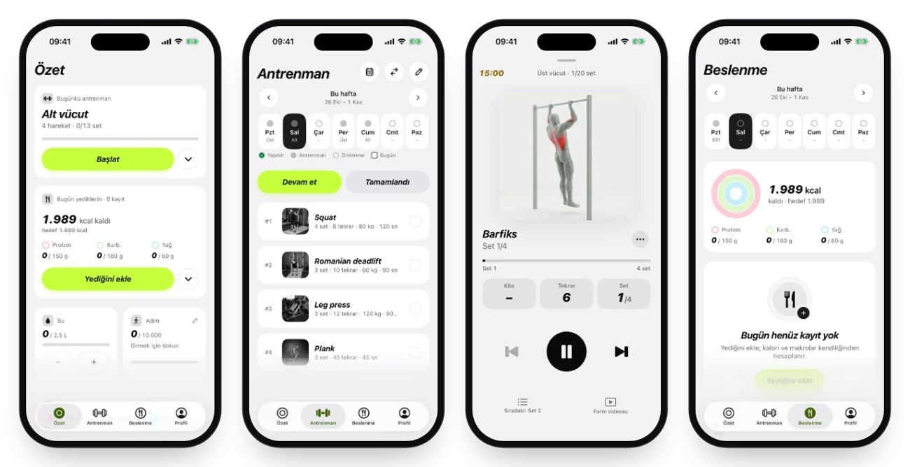
A design language that steps back
Geist gave way to SF Pro; big numbers use SF Pro Heavy Italic with fixed-width digits so they do not jump while they count. The accent went from orange to a near-black primary and, after side-by-side tests, to a neon lime (#C6FF3D) for every primary action, the selected segment and the app icon. Dark mode drops borders; buttons are pills and every target is at least 44 points.
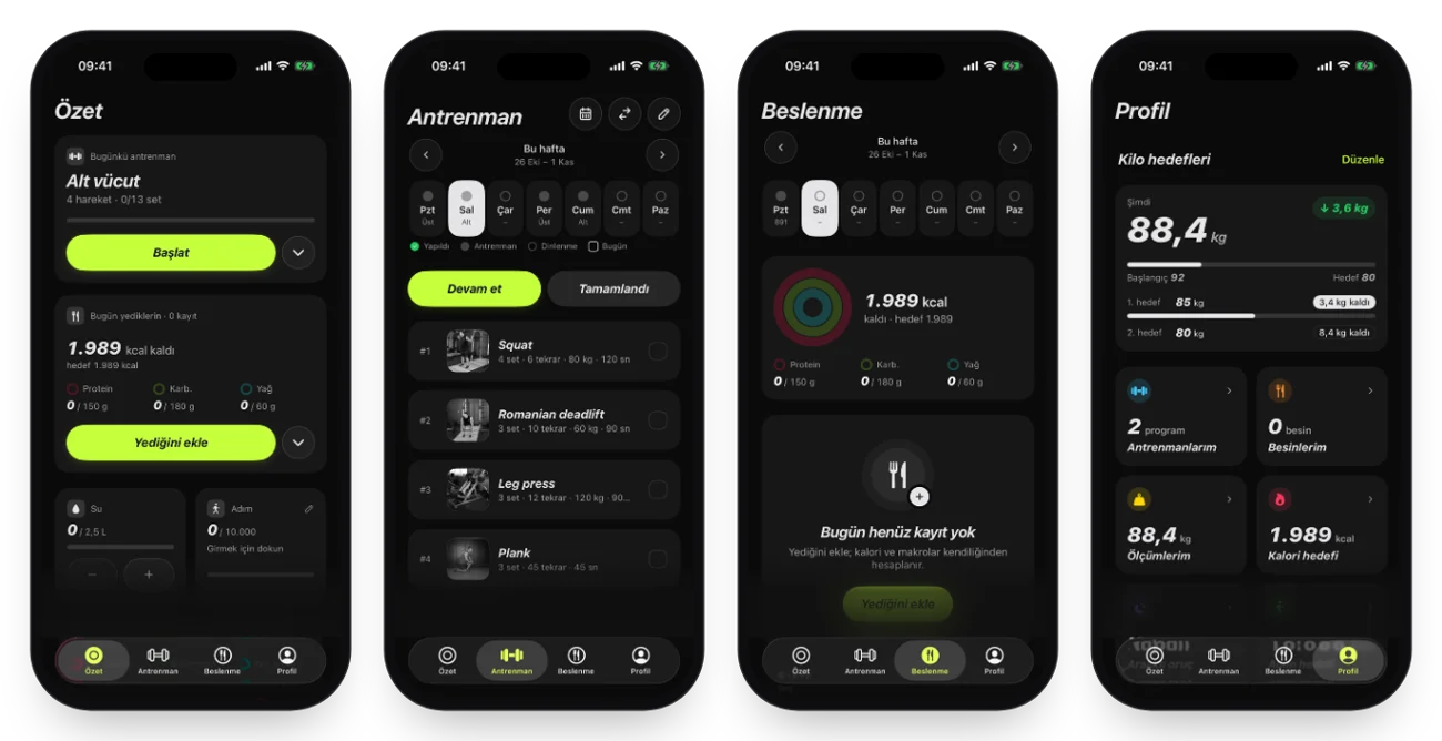
Built for between sets
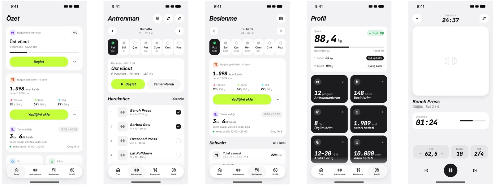
The session player starts its clock the moment it opens. The rest countdown runs as a Live Activity on the Lock Screen and in the Dynamic Island, and Home Screen widgets show today's workout and the calories left. Empty states share one pattern: a symbol, one sentence and a single primary action.
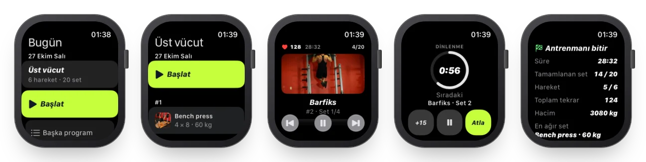
Apple Watch, from the wrist
The watch app runs the whole session from the wrist: today’s workout, the player, a rest ring with +15, pause and skip, heart rate and a summary. I designed it before I owned a watch, with paired simulators that seed demo data. Once I bought one, I added complications for the Modular face: a fasting countdown, calories left, steps and today’s workout.
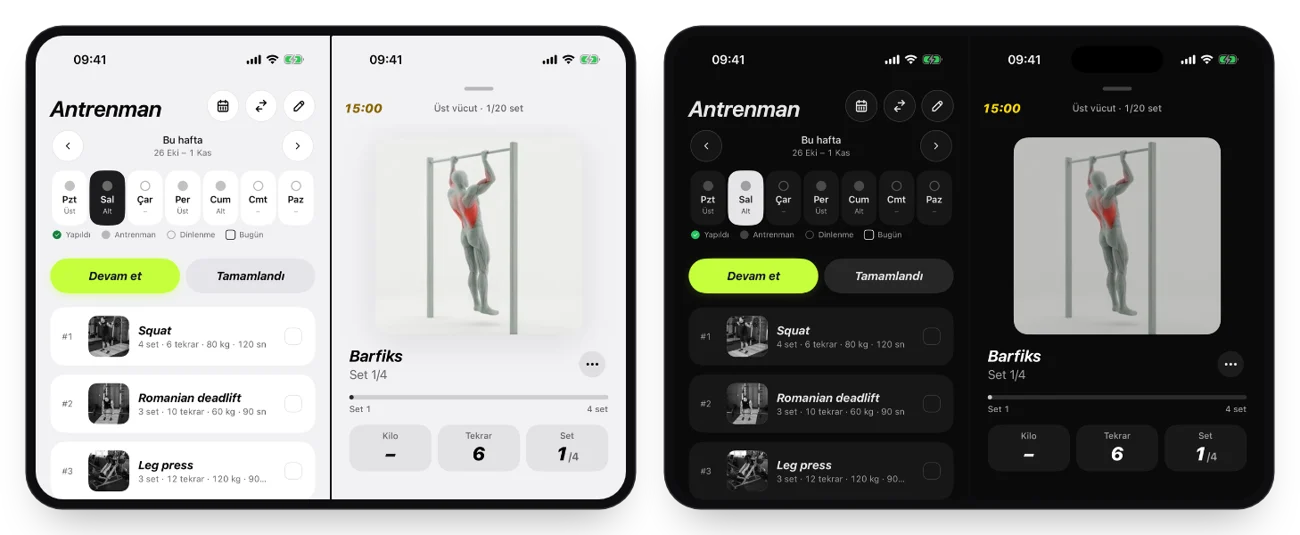
Two panes on iPhone Duo
On the foldable iPhone Duo the workout list and the session player sit side by side, so the next exercise is always in view while a set is running.
A Figma design system that matches the code
The design system was rebuilt from the code, not the other way round: colour variables with light and dark modes aliased to primitives, text styles, spacing and elevation, components with variants and swappable icons, every screen recomposed from them and linked into a prototype, plus the watch components, complications and widgets. When the action colour moved to lime, the token changed in Swift, on the website and in Figma in the same hour.
QA, then the store
Each round of QA produced coded findings in a PDF report and a task board, from data import edge cases to performance on the summary screen. App Store screenshots for iPhone and Apple Watch come straight from simulator scripts with demo data, so a design change is one command away from new store images.
How I used AI
Claude was my pair from the first sketch to the App Store. It wrote the first version of most of the SwiftUI and the tests, built the Figma variables and components through the plugin API, ran coded QA rounds and code reviews that ended in PDF reports and a task board, scripted the simulator screenshots and rendered this cover film. My part was the one a design lead plays: frame the problem, set the principles (free, private, calm), make the product and design calls, test every build on real workouts and review what shipped. AI changed the speed; the judgement stayed mine.
The outcome
About a week from idea to App Store, approved by App Review, then a 1.1 update with a customisable summary, Apple Watch complications and data export. A native app for iPhone and Apple Watch with Apple Health, iCloud sync, widgets and a Live Activity, and a Figma design system that matches the code. There is no commercial goal behind it: GYM Paper is free and stays that way. Next: progressive-overload tracking and a step leaderboard with friends.